7 Often-Overlooked Standard Deal Toy Shapes
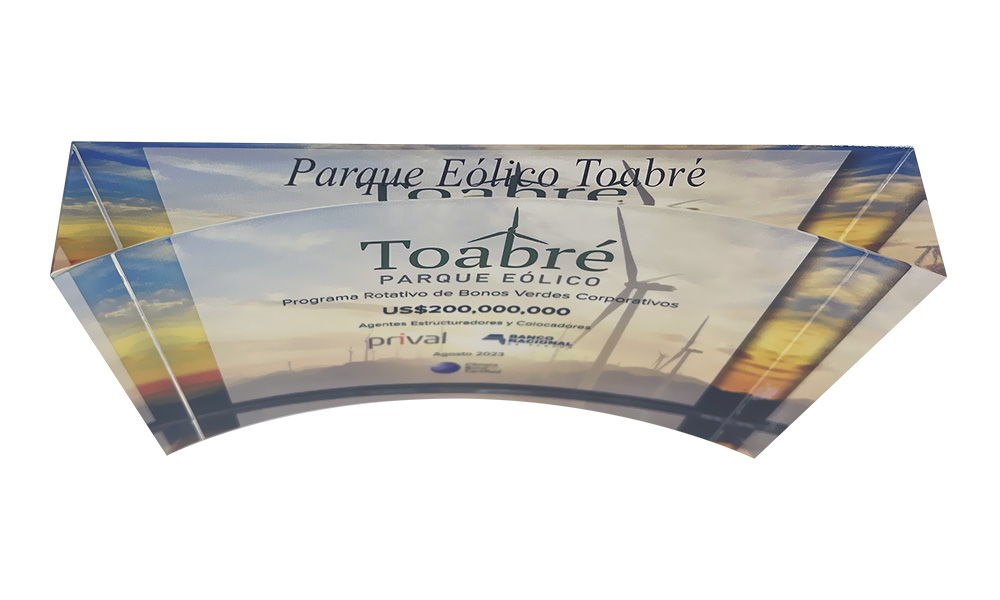
You probably don’t spend a lot of time monitoring trends in deal toy design, specifically classic deal toy shapes. Certainly, no one’s suggesting that you should be. You’re much more likely to be attuned to even subtle changes in the world of fashion, or to the announced design tweaks to the latest iteration of your smartphone or watch.
But if you’re as focused on deal toys as we are, and you have been for over 40 years, you tend to notice designs that fall in and out of favor.
Some of these deal toy shapes seem to have been relegated to yesteryear. It’s not likely you’ve seen too many examples recently of such once-popular designs as the “faceted cube”, the “pup tent”, or the “lying wedge”. And you probably won’t see many of those shapes in the future.
The seven variations in common, classic deal toy shapes that we’ve highlighted below aren’t in danger of disappearing anytime soon. But you still might want to keep them in mind as variations offering an extra element of cachet—even to otherwise relatively conventional deal toy designs.
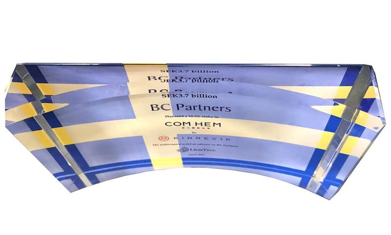
Top view of a flat-back curve, a deal toy design combining elements of a curve and a rectangle.
The Flat-Back Curve Deal Toy Design
The flat-back curve is a pretty simple variation of a rectangle design. But the scooped-out front still manages to give it a distinctive, and eye-catching touch.
Flat-back curves tend to work especially well when there is a dominant visual element. An example is the Swedish flag in the deal toy design above.
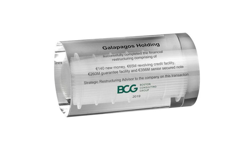
A lying cylinder deal toy featuring the 3D etching effect.
The Lying Cylinder
The product at the heart of the transaction above is a heat exchanger. It’s effectively showcased here with the use of 3D laser etching, a process that’s specific to crystal.
Beyond the 3D etch effect, what really makes this design so effective is the chosen shape. A lying cylinder design is a great way to display a central element like this with a horizontal orientation.
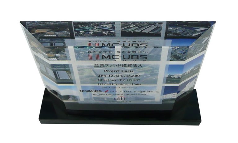
A thin or “skinny” trapezoid design.
The “Skinny Trap” Deal Toy Shape
The mere mention of the word “trapezoid” can launch some of us into a traumatic, eye-twitching flashback to high-school geometry classes, and long-forgotten formulas for area and circumference.
As much as you assumed in high school you’d never encounter the shape in adult life, you may want to give some thought to a thin trapezoid—or, as it’s often called, a “skinny trap”.
The skinny trap is another example of a design variation that plays off a more conventional shape. That said, it’s one that can give a little more prominence to a simple rectangle design. It can also bring additional focus to the featured visual element, in this case photos from the property portfolio that the transaction involved.
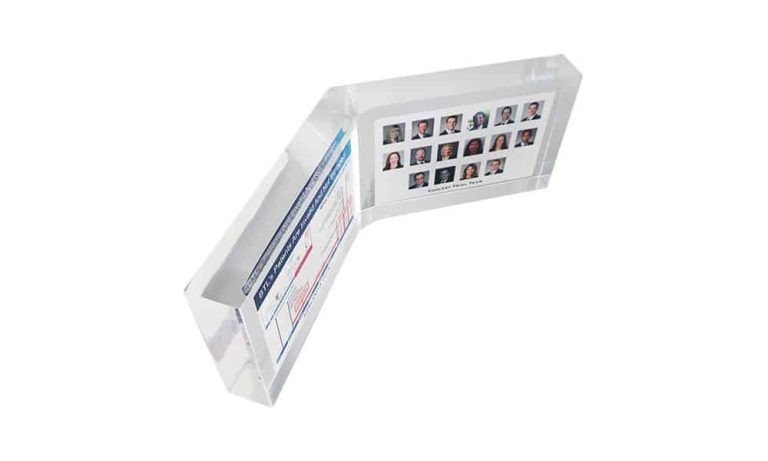
Top view of “open book” design.
The “Open Book” Design
The two-panel or “open book” design is pretty self-explanatory. You often see it used along pretty literal lines, in a deal toy design commemorating a deal in the media, publishing or education space.
But the open book shape can work well in any design in which two visual elements are meant to receive equal emphasis and weight. The piece shown above is not strictly a deal toy. It’s a design ordered by a law firm commemorating a successful patent infringement action. Appearing alongside the details of the litigation—and receiving equal prominence—are photos of the attorneys who contributed to the victory.
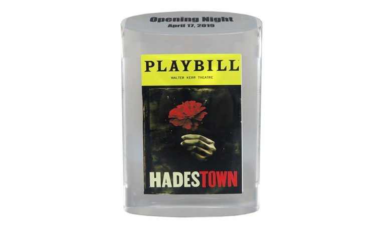
Though not strictly a deal toy, this Broadway opening commemorative is a great example of a slant-top oval.
Slant-Top Oval Design
The piece shown above is also not a deal toy. However, it is relevant when considering classic deal toy shapes. It commemorates the opening night of the long-running Broadway musical “Hadestown”.
But we’ve included the piece here because it’s such a great example of the virtues of the slant-top oval design. The slanted top gives the piece an extra design element, and frequently this is a spot where, for instance, a logo can be printed or laser-etched.
The other, somewhat less obvious advantage of the slant is a practical one.
The additional space maximizes the design elements and information clearly visible from the front. The words “Opening Night”—along with the date—could conceivably have been placed on the back, or even etched at the bottom of the piece. But placing them on the slant, though, gives them significantly more visibility and prominence.
Slant-top Cylinder Shapes
The slant-top oval design has two virtues that tend to set it apart from other deal toys and awards you might have on display. Its compact desgin makes it shorter than most other desgins. Also, the angled face can the text, image, or logo more prominent.
The gallery above showcases a variety of slant-top designs in both crystal and Lucite.
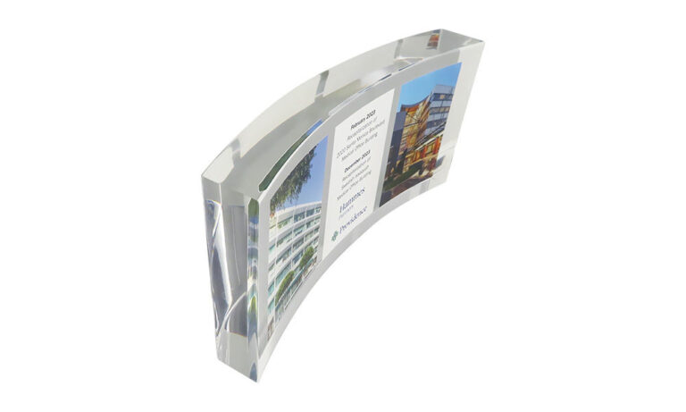
Curve designs can vary in the severity of the bend. This Lucite design has a more subtle, less pronounced curve.
Curve Designs
Curves offer another way of enlivening a simple rectangle design. The degree of curvature can be more extreme. But it can also be relatively subtle, as in this Lucite piece above.
“Standard” Deal Toy Shapes Don’t Have to Be Boring
At The Corporate Presence, we’ve been designing deal toys for over four decades. We pride ourselves on offering clients a full range of design possibilities, from highly customized and complex, to more conventional and understated.
Hopefully this post has shown you that even relatively conventional shapes and designs don’t have to be boring or commonplace. Whatever your preference, you can rely on us to provide you with some truly memorable deal toy design options. Reach out to us today.
David Parry is the Director of Digital Strategy for The Corporate Presence, and for Prestige Custom Awards, a designer and provider of custom corporate awards ranging from creative employee and client recognition pieces to the N.F.L. Commissioner’s Awards, and ESPN’s ESPY awards.der
Contact Us For a Quote Today
"*" indicates required fields